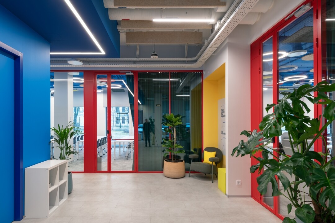
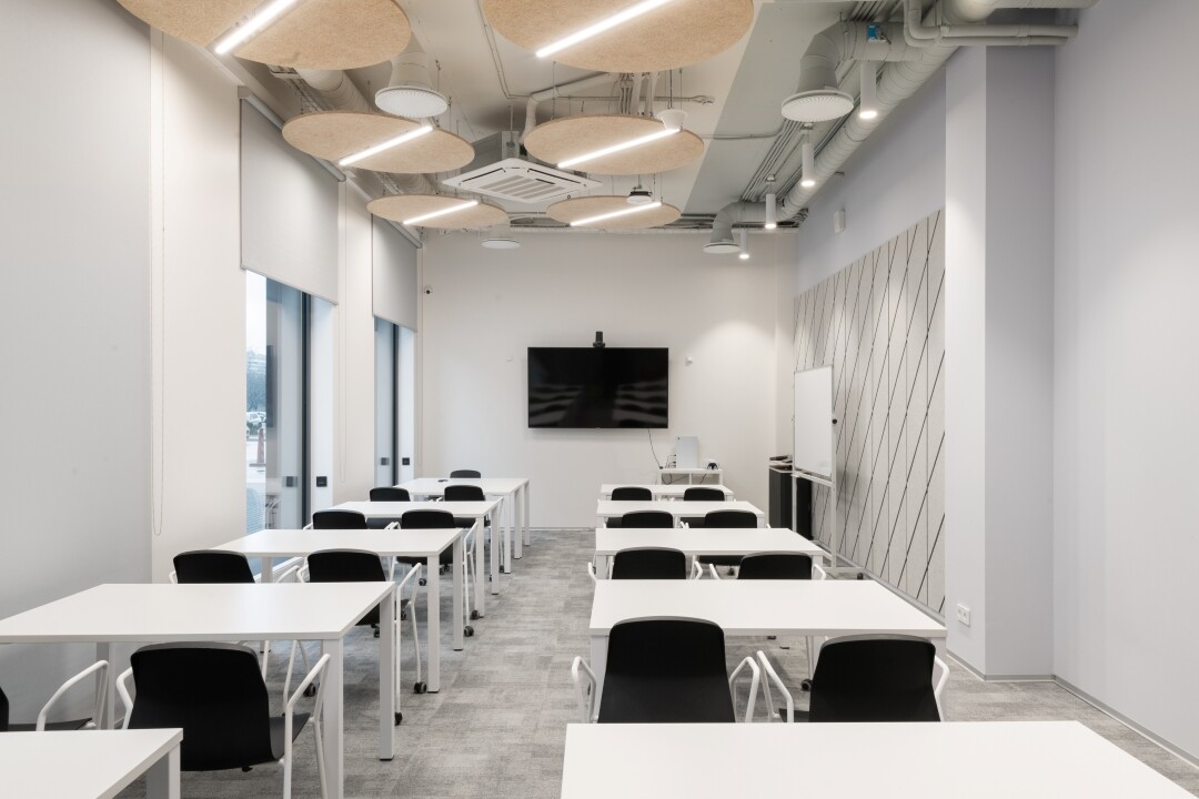
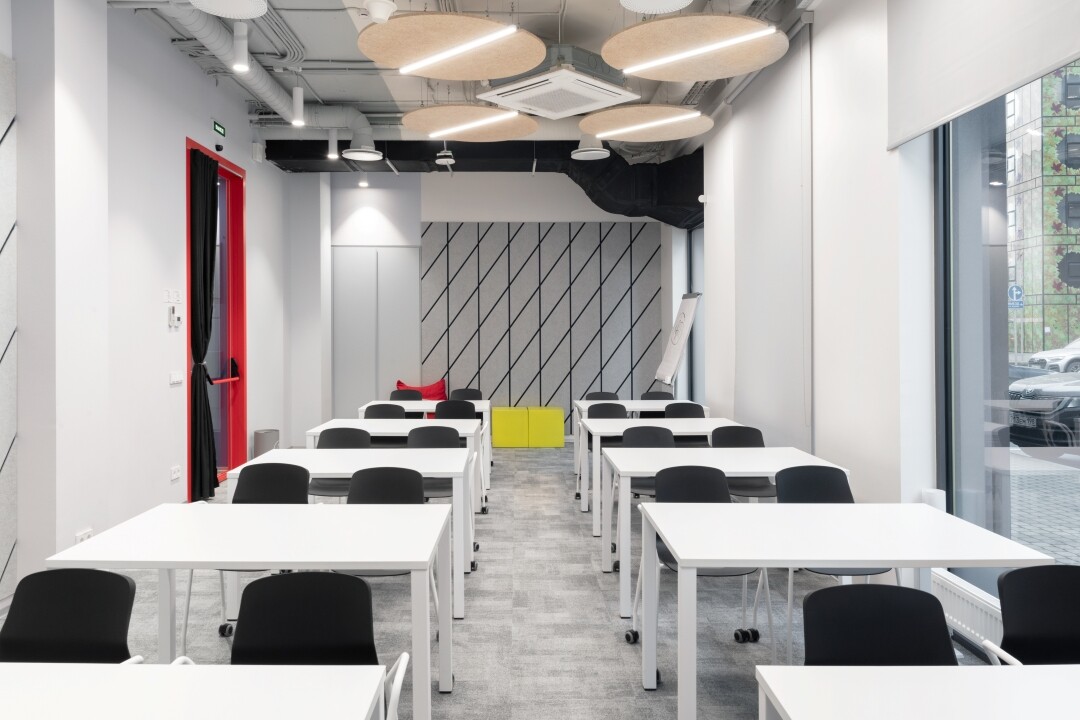
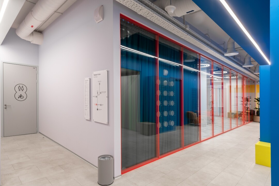
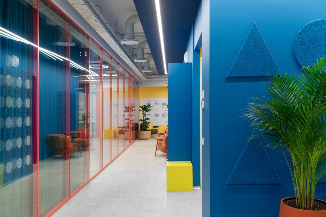
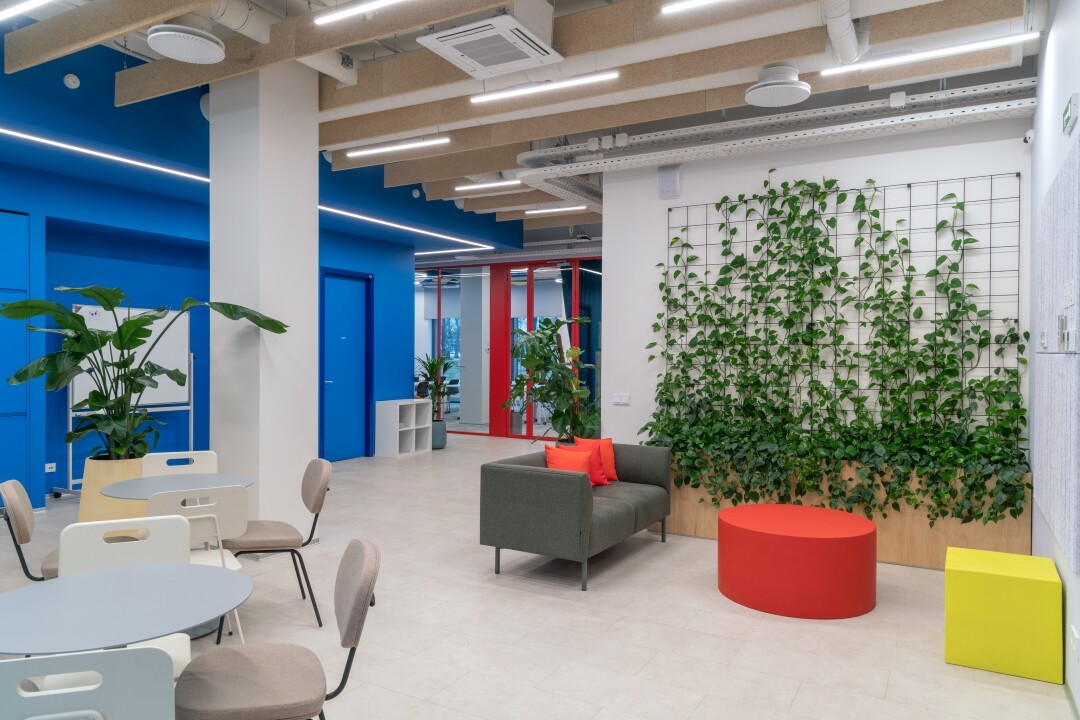
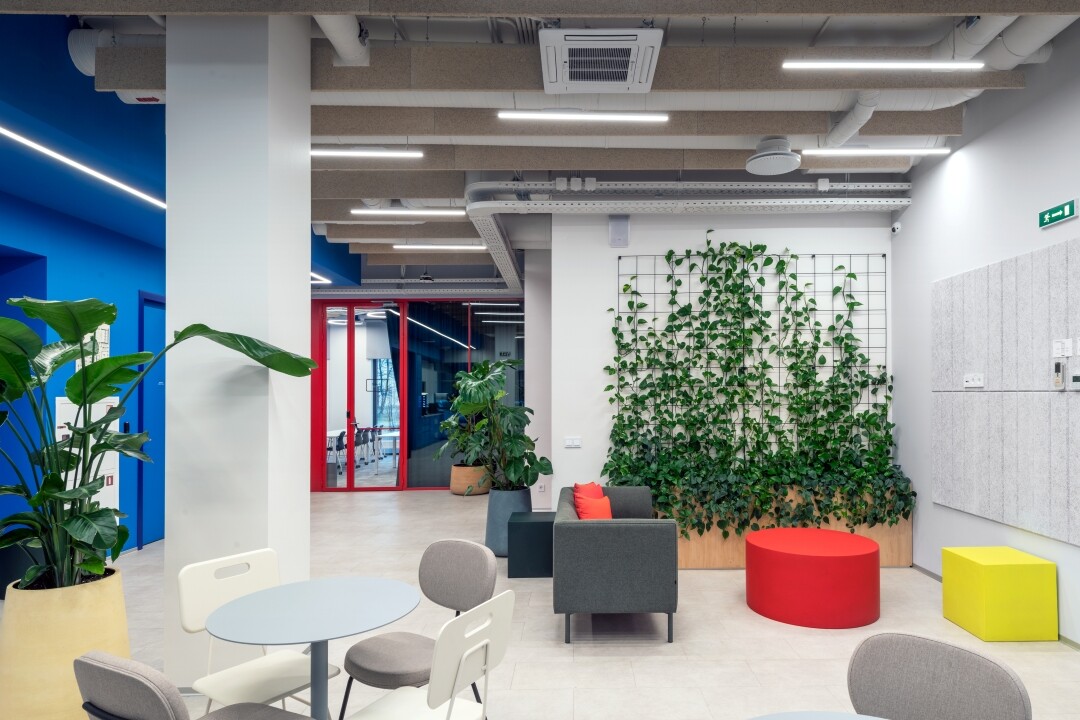
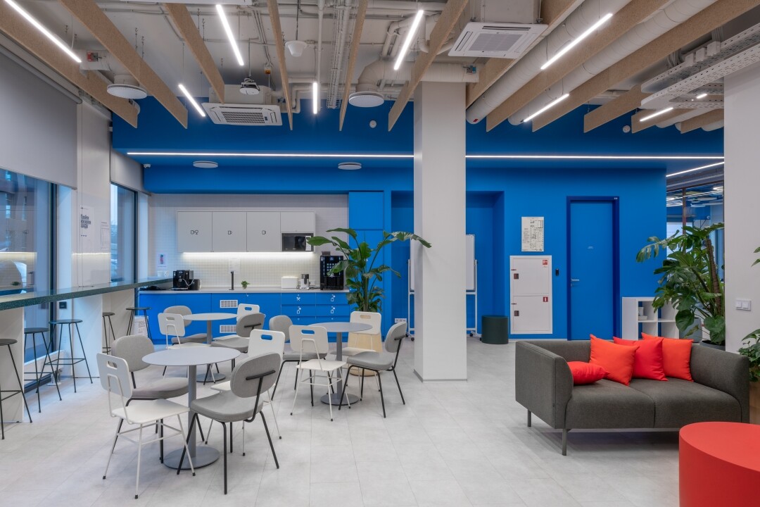
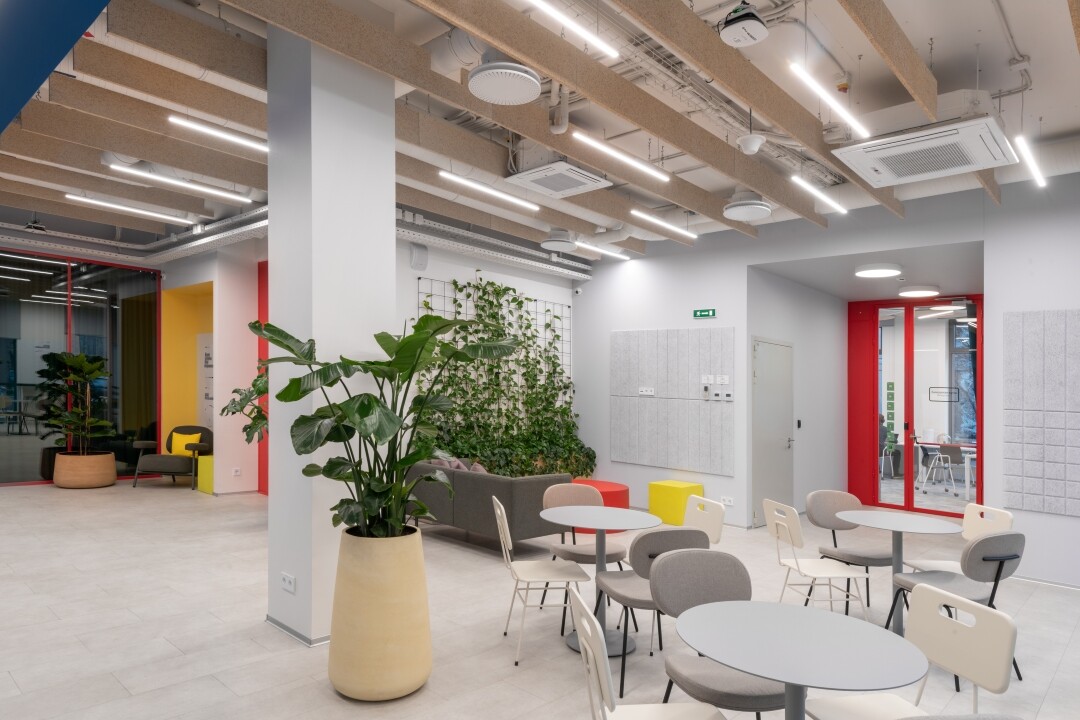
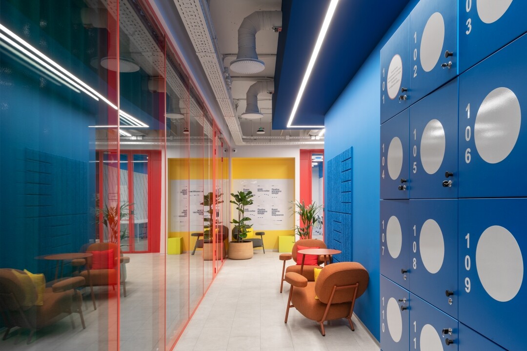
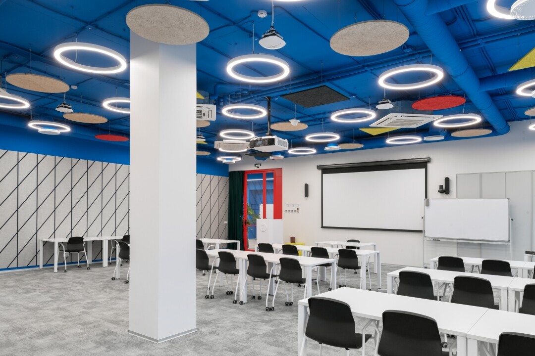
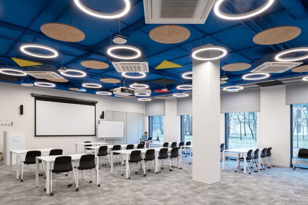
The 450-square-meter educational hub is located in the Ferrum business center on Sverdlovskaya Embankment. Previously, OFFCON featured the company's main office, "Architectural Modernism in Complex Colors." The defining feature of this new space lies in its straightforward design solutions, bold accent colors, and pure functionality.
The core concept of the project is rooted in the visual imagery of a classic squared school notebook and handwriting workbooks—an approachable, dynamic pattern that harmonizes naturally with the building's facade.
"It is something everyone remembers from school—first handwriting practice sheets, and then squared notebooks. It is the strongest visual association with education. We used this as our starting point because the foundation of data analysis is built upon the functionality of well-defined parameters," says Principal Architect Aglaya Van-Van-E, explaining the concept.
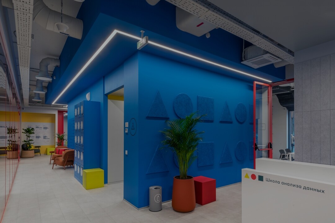
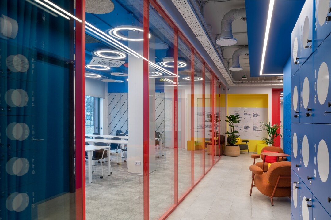
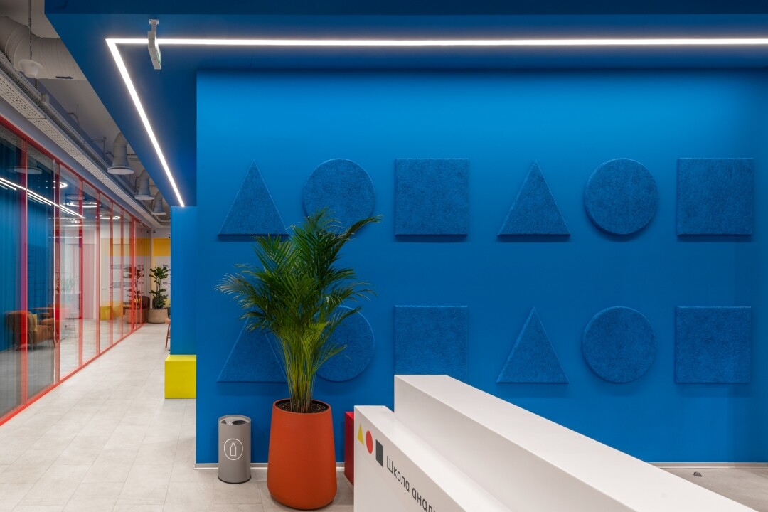
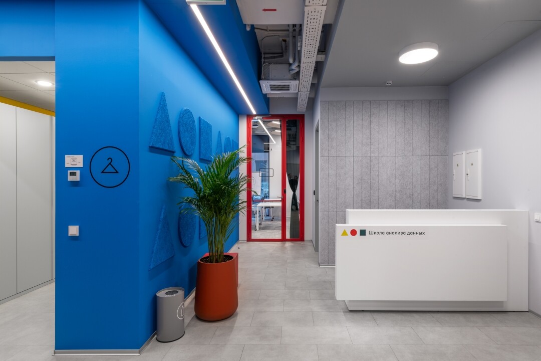
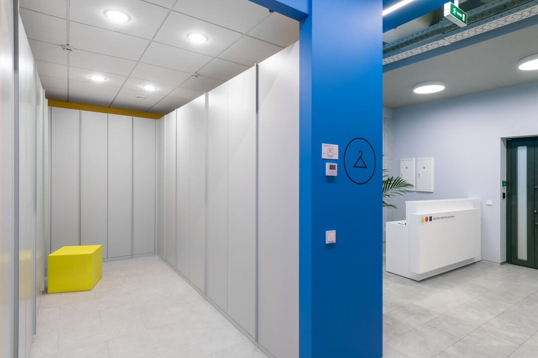
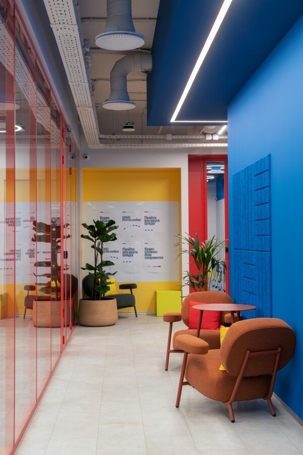
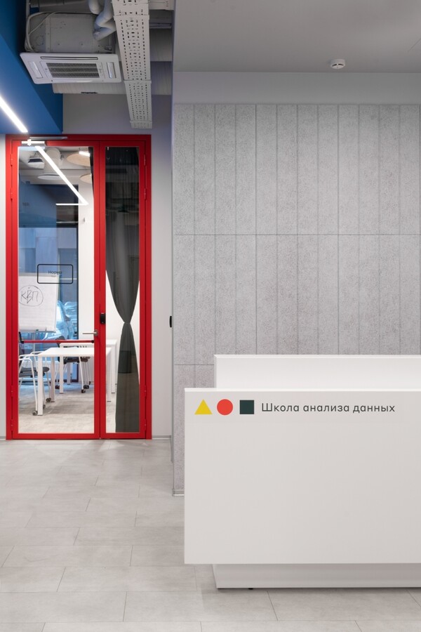
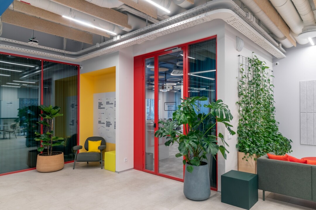
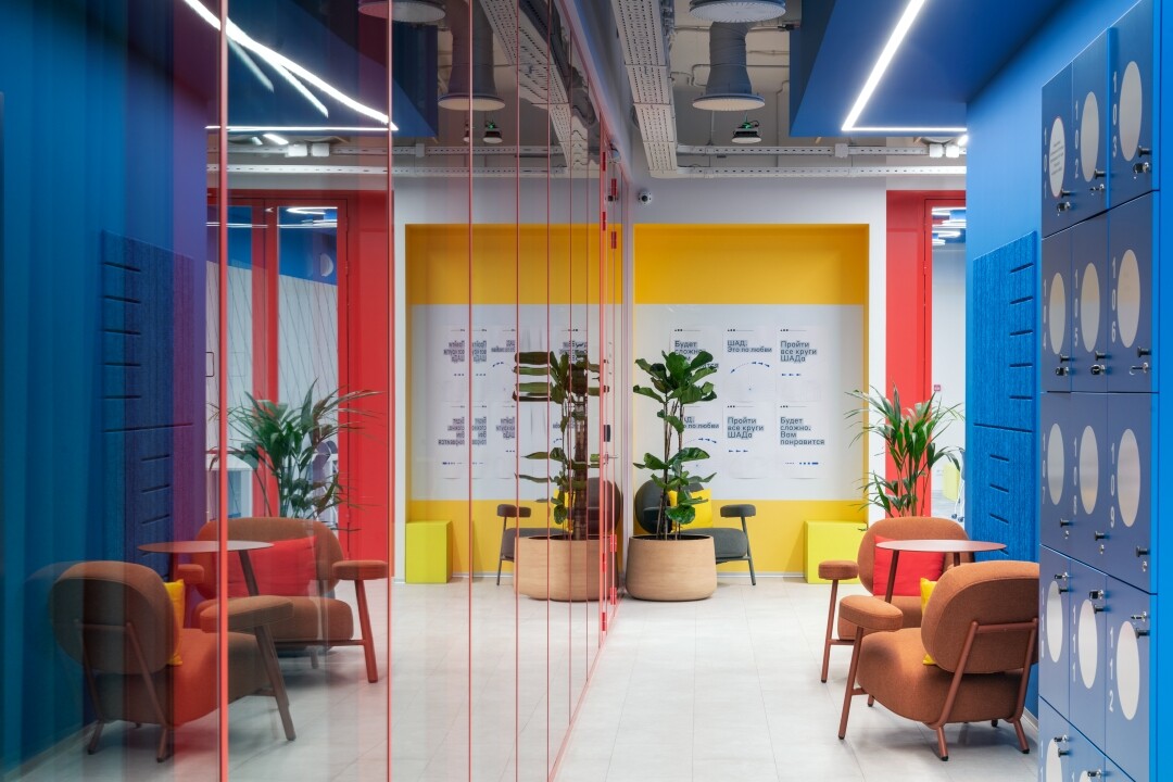
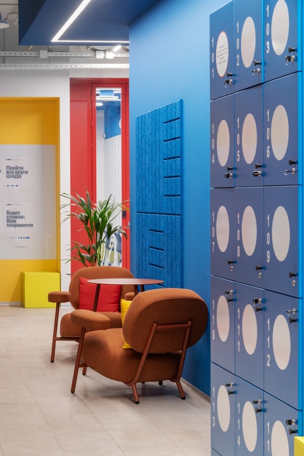
The second starting point was a bold color palette. The primary shades are a deep, ultra-bright blue and lemon yellow, complemented by the brand's signature red and dark green. The interplay of these hues establishes the spatial verticals and horizontals, creating depth and volume. Meanwhile, auxiliary areas are finished in neutral white with a single bright accent. This is seen, for example, in the cloakroom, which features a milky-white floor, lockers, and ceiling paired with a bright yellow cube bench for convenience.
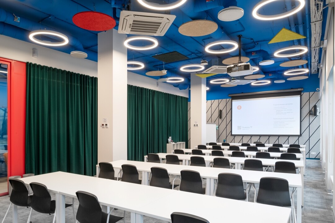
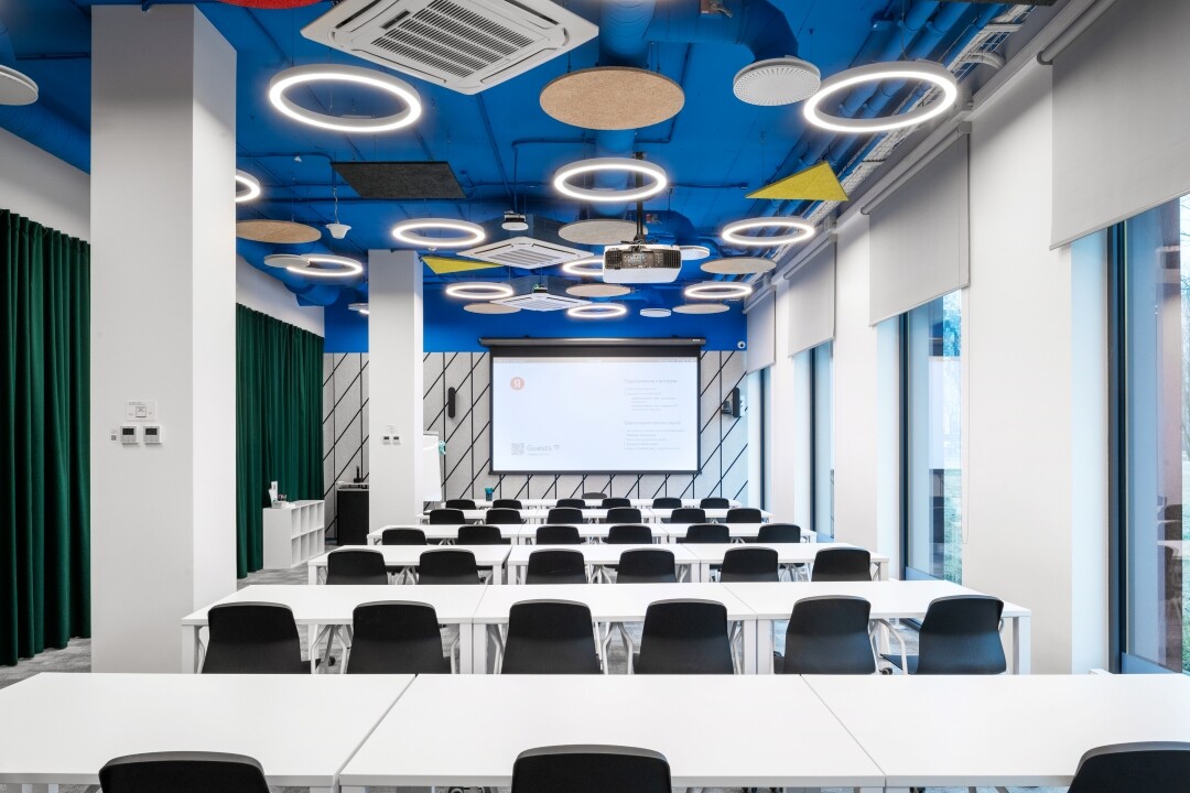
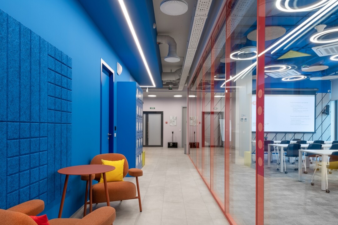
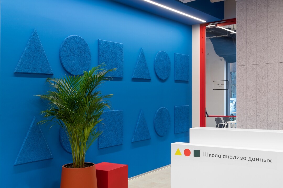
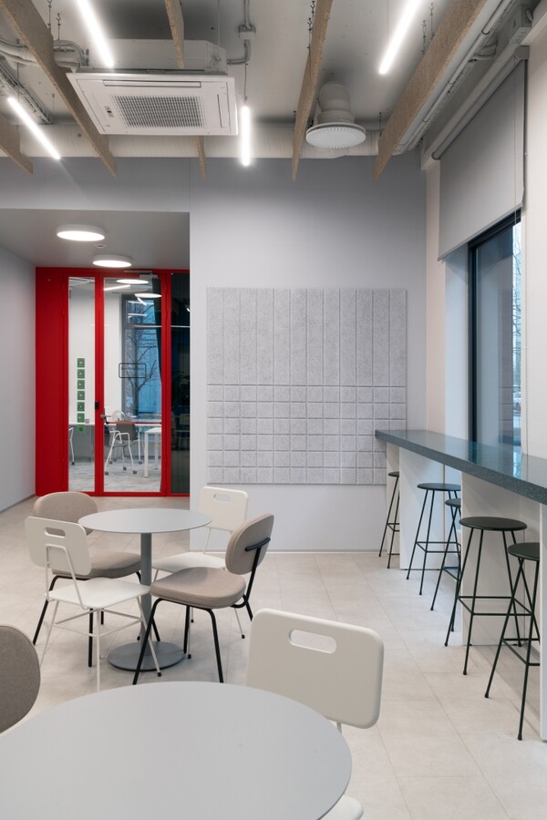
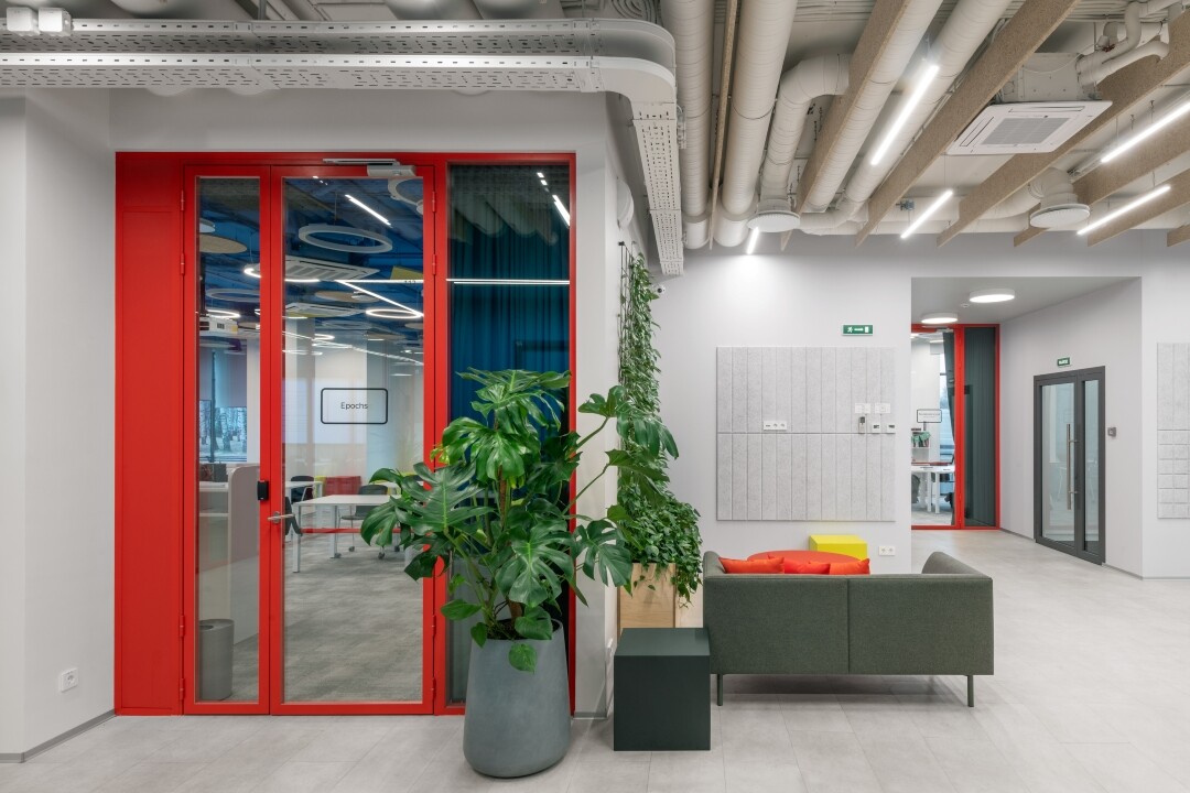
To complement the color scheme, the architects introduced another layer: familiar geometric shapes—circles, triangles, and squares—scattered throughout the school. These elements appear on the walls, echo the ceiling light fixtures, cut across the space diagonally, and draw the eye to the acoustic wall panels.
At first glance, the wall panels appear identical, yet they are not. Look closer, and you will spot a green square here or a red circle there. This playful school motif—reminiscent of extra-credit "asterisk" challenges—continues throughout the space even outside the classrooms.
The finishes rely on straightforward, honest materials, paired with functional furniture in the lecture rooms, comfortable armchairs and sofas in the coffee point, and lush greenery in the high-traffic and lounge zones.
The architectural lighting is simple yet reinforces the central theme of an engaging learning process—the ceiling fixtures themselves join in a game of "Tic-Tac-Toe."
Aglaya Van-Van-E, Principal Architect of the project, comments:
"Although this is the smallest of all the Yandex offices we have designed, it turned out remarkably vibrant and true to the school's energetic brand identity. The space is pulled together using just a few active colors and very simple solutions, yet it achieves maximum visual impact."